Monday 24 August 2015

How does the Australian Bureau of Meteorology ACORN-SAT data compare to its source?


In previous posts I’ve examined the Australian Bureau of Meteorology’s temperature records.

In this article, I examine the Bureau’s practice of ignoring data prior to 1910. I also look at the adjustments the Bureau has made to the original data. ACORN-SAT is the adjusted temperature record. CDO is, supposedly, the ‘raw’ data.

Here’s a few samples from the full article:

This graph shows all of the weather stations used by the BOM for ACORN-SAT but with the pre-1910 data included.

Two things stand out:

1. There was rapid warming from 1860 to 1900, much more than the little bit of warming seen since 1900.

2. 1900 was the hottest year since records started in 1860.

ACORN_CDO temperatures

The adjustments make the period 1910 – 1950 appear colder.

BOM ACORN Adjustments

There is nothing special about the years 2013 and 2014. I’ve shown four decimal places on the temperatures. In reality, we’d be lucky to measure to the nearest degree. So in 1900, the average maximum temperature was 27 degrees Celsius. In all the other years, the maximum average temperature was 26 degrees Celsius. No big deal.

BOM ACORN average maximum temperaturess

Unfortunately, I’m lead to the following conclusions:

1. The year 1900 is likely to have been the warmest on record.

2. The rate of warming from 1860 to 1910 it much larger that any warming experienced in the recent past.

3. There was a systematic downward adjustment of temperature records prior to 1950. This makes more recent temperatures appear warmer by comparison.

It’s may be coincidental that both the decisions to eliminate pre-1910 data and to systematically adjust pre-1950 temperatures downward, support the hypothesis of human-induced global warming.

If it is a coincidence, it’s a mighty big one.

Click here to download the PDF

Monday 17 August 2015

Australian Bureau of Meteorology Station Data Review –continued.

In a previous post I address the question "Are the weather station descriptive data for the CDO and ACORN-SAT datasets consistent?"

In this post I address the question "How do the operational timespans of ACORN-SAT and CDO weather stations compare?"

You'll remember that ACORN-SAT is the "Australian Climate Observation Reference Network - Surface Air Temperature" dataset.  It is derived from the BOM’s Climate Data Online dataset.
Click here to visit the CDO site at the BOM

Here’s a quick summary of my findings:

1. The 112 ACORN-SAT weather stations are actually combinations of 202 CDO stations. It’s unclear why site identifications numbers were combined.

Here’s an example for Mackay, Queensland.

In CDO, Mackay had four different site identification numbers (033297, 033046, 033047 and 033119). In ACORN-SAT, these have all been combined under a single site number 033119. The identity of the other three sites is lost.

Mackay    033119    033297    MACKAY COMPARISON
Mackay    033119    033046    MACKAY POST OFFICE
Mackay    033119    033047    TE KOWAI EXP STN
Mackay    033119    033119    MACKAY M.O

2. There are 1703 CDO sites that could have been used for ACORN-SAT.  Just 202 were chosen for this purpose. It’s unclear exactly how these choices were made.

3. The BOM did not use any temperature data prior to 1910 for ACORN-SAT, despite data for one station being available back as far as 1855. The BOM explains that it didn’t include pre-1910 data as it was unreliable. Other claim the that1890s was a particularly hot period in Australia. In a future post I’ll look at the pre 1910 data in more detail.

Click here to download the full PDF document

The full PDF contains lots of detail about the stations, their starting dates of operation and the total time that various stations operated.

Saturday 18 July 2015

Australian Bureau of Meteorology Station Data Review


In a previous post I described my adventures downloading and converting the Bureau of Meteorology’s (BOM’s) Climate Data Online (CDO) and its Australian Climate Observation Reference Network – Surface Air Temperature (ACORN-SAT) datasets.

The BOM claims “The Australian Climate Observations Reference Network – Surface Air Temperature (ACORN-SAT) dataset has been developed for monitoring climate variability and change in Australia. The dataset employs the latest analysis techniques and takes advantage of newly digitised observational data to provide a daily temperature record over the last 100 years. This data will enable climate researchers to better understand long-term changes in monthly and seasonal climate, as well as changes in day-to-day weather. ”

Another BOM statement is more worrying: “ACORN-SAT is a complete re-analysis of the Australian homogenised temperature database.” The emphasis on ‘re-analysis’ is mine.

As Gary Smith says in his wonderful book, Standard Deviations: Flawed Assumptions, Tortured data and Other Ways to Lie with Statistics, self-selection bias leads researchers to find what they are looking for and to ignore anything that contradicts their pet theories.

In the case of climate change research and temperature records, this may lead researchers to find the past temperatures colder ‘than first thought’ and more recent temperatures warmer. I’m keen to see if there is any evidence of this taking place with Australia’s BOM.

I sincerely hope not.

You may recall from the last post on this topic that the CDO database contains temperature data from 1,871 weather stations from around Australia, dating as far back as1855. There are separate records for maximum and minimum temperatures and to be useful, both maximums and minimums must be available for the periods of time in question.  On this basis, CDO contains data for 1,718 ‘useful’ stations, as I’ve chosen to call them.

The BOM has selected 112 of these stations to form the ACORN-SAT dataset.  Why 112? the BOM explains “The locations are chosen to maximise the length of record and network coverage across the country.” Sounds fair enough, but leaves the question what’s wrong with the others?

BOM Question 1 Is  descriptive data consistent

Note: The black dots are ACORN-SAT stations. The red dots are CDO stations.

While reviewing the documentation associated with the data, I discovered another interesting fact: The 112 ACORN-SAT stations are actually composed of records from 202 CDO weather stations.

Confused?  I was.

Only 38 of the 112 station records are based on a single weather station.  The remaining 74 are composites of the data from 2, 3 or in one case 4 separate weather stations. While there are, no doubt, excellent reasons for doing this it makes before and after adjustment comparisons more difficult.

Even the exact makeup of the composite stations was difficult to clarify.  BOM documents describing the final station makeup gave different results. This crucial information was not available electronically.

Never mind.  I got it in the end.

I’ve compiled an extensive analysis of the station data that’s available as a PDF from the link below.

It’s based on queries of my downloaded database and was analysed with Mathematica. It’s got maps and is pretty self-explanatory, but probably a bit too detailed for some.

Click here to download the PDF file.

There’s one more bit of analysis I intend to do prior to looking at the actual temperature data. In my next post I’ll address the timespan of both the CDO and ACORN-SAT stations. The BOM claims that it picked CDO stations with the longest periods of observation for ACORN-SAT.

We’ll see.

Wednesday 15 July 2015

New Horizons and silly statements

I was quite excited to see the wonderful images of Pluto taken by NASA’s New Horizon probe.

CJ4QOP6WEAAgqD9

Click here to see the image on NASA's Twitter page

The Australian (my daily paper of choice) carried an article by Michio Kaku of the Wall Street Journal, telling us a little about the mission. Click here to read the original article.

I was intrigued with the headline “Pluto mission New Horizons may save us on Earth”. I was worried that somehow Pluto was going to be related to climate change, but was relieved that the claim was only that knowing more about comets would have saved the dinosaurs.

A bit of a stretch, I thought.

Two sentences in particular caught my eye:

“But first, scientists need to know if it survived the chaotic Kuiper Belt, the region beyond Neptune which Stern has described as a “shooting gallery” of cosmic debris.

NASA expects to receive a signal from the spacecraft later on Tuesday to find out whether or not the spacecraft made it through intact.”

Make it through the Kuiper belt? By Tuesday?  Read about the Kuiper belt by clicking here.

The Kuiper belt is a vast donut shaped area filled with rocks, lumps of ice and other spacecraft hazards.

The entire belt extends from 30 to about 55 AU from the Sun.

An AU or Astronomical Unit is a measure of distance used by astronomers when dealing with Solar System sized distances. It’s the distance from the Sun to the Earth and about 93 million miles or 149.6 million kilometres.

The main part of the belt starts at about 40 AU from the Sun and extends to about 48 AU. That will be the most hazardous part of the journey for New Horizons.

At present, New Horizons (and Pluto) are about 33 AU from the Sun. Click here to see more about New Horizons and Pluto. Its only 2 AU into the belt and is still about 8 AU from the main belt.

At it’s present speed of about 50,000 kilometres per hour, it’ll take 2.4 years for it to reach the start of the main belt, 5.2 years to reach the end of the main belt and 7.6 years to reach the outer edge of the entire Kuiper belt.

To be fair, the writer didn’t say which Tuesday.

He could have meant 395 Tuesdays from now.

Friday 10 July 2015

Using Australian Bureau of Meteorology data II

Getting ACORN-SAT data from the BOM

In my last post I went through, in some technical detail, how I extracted the Climate Data Online (CDO) data from the Australian Bureau of Meteorology (BOM). Click here to access the BOM CDO data pages.

Today I’ll go through the same process with the Australian Climate Observation Reference Network – Surface Air Temperature dataset.

If you remember, I set out to look at the differences between the raw data (CDO) and the adjusted data (ACORN-SAT) that have generated considerable controversy and a government inquiry into the behaviour of the BOM.

Click here to access BOM's ACORN-SAT page.

A quick look at the ACORN-SAT page made my antennae twitch:

“ACORN-SAT is a complete re-analysis of the Australian homogenised temperature database.”

I’m hoping that’s not BOM-speak for “the previous temperature database didn’t support our view on global warming so we ‘re-analysed’ it”.

I also noticed that no station data prior to 1910 are available.  Remember last time, I mentioned the hot 1890s? But I’m getting ahead of myself.

BOM ACORN-SAT station list

The page has a link for a “Sortable list of ACORN-SAT stations with linked data. Through a process called ‘screen scraping’ I was able to just select all of the entries in the table, drop it into Excel, save the worksheet and import it into SQL Server. For the next step I also save the spreadsheet as a CSV file to make it easier to access in my conversion program

So far, so good.

The next step was to add two more functions to my conversion program. The second button from the right reads the CSV version of the spreadsheet, looping through the stations. As the screenshot above shows, the minimum and maximum temperature data are hyperlinks.  They’re actually hyperlinks to the text files containing the data.Convert BOM data

My program uses the link to download the data and store it in a text file on my laptop.

The rightmost button loops through the 244 files I’ve downloaded, does some error checking, then stores the data in the SQL Server database. The data is a record for each station for each day of each year giving the minimum or maximum temperature.

There’s one odd thing I noticed right away. When no data is available for a particular station for a particular day, instead of leaving it out, the BOM has used a ‘dummy value of 99999.9 degrees Celsius. Talk about global warming! Imagine using that value in a calculation.

Just for fun, I calculated the average for station 10092 (Merredin, Western Australia) using the dummy value. I know WA is hot, but an average temperature if 1,634 degrees Celsius seems a bit excessive.

I know the value shouldn’t be actually used, but leaving the record out or using a standard value like NULL is preferable an removes the chance of an error like this creeping into a calculation.

Using NULL instead of 99999.9 gave the more realistic (and correct) average temperature of 24.8 degrees.

For readers unfamiliar with database technology, using the NULL value for calculating the average does three important things:

  1. It clearly marks the record as having missing data.
  2. When computing the sum, this record is skipped.
  3. When dividing the sum by the number of records, the number of records is adjusted as well.

Using a dummy number like the BOM has done is 1960s style data handing practice and should definitely be a no-no in 2015.

I’ve changed the 99999.9s to NULLs in my copy of the database.

I completed the initial database build and found 3,635,866 minimum temperature records of the expected 112 sites and 3,635,933 maximum temperature records for the same 112 sites.

Some of the initial questions that occur to me, that I intend to explore include:

  • Why is the number maximum temperature records different from the number of minimum temperature records?
  • Why were just these 112 sites out of a possible 1871 chosen?
  • How different is each ACORN-SAT site from its CDO equivalent?
  • Exactly what adjustments were made?
  • How are the adjustment justified?
  • How were the adjustments made?
  • What are the uncertainties in these measurements?
  • How different are the trends indicated by each dataset?

I will welcome any additional suggestions from anyone who happens to follow this blog. I’m also happy to make details of the source code and scripts used in the compilation of this database. I’m happy to make the database itself available more generally, subject to any copyright restrictions that may exist.  I’ll look at that issue more closely.

In my next post I’ll report on my initial look at the data.

Using Australian Bureau of Meteorology data

Overview

As I discussed in my last post, I’ve decided to have a look at the climate data managed by the Australian Bureau of Meteorology (BOM).

I specifically want to look at two aspects:

  1. How different are the raw and adjusted data sets?
  2. What mechanism are used to adjust the data?

I’ve decided to limit my investigation to temperature data. The argument’s about global warming isn’t it?

Accessing the data

The BOM maintains two main temperature data sets. 

The raw, unadjusted data is available through a system call Climate Data Online or CDO. Click here to look at the BOM's Climate Data Online

The second has the catchy name ACORN-SAT that has nothing to do with oak trees or satellites. Of course, it stands for ‘Australian Climate Observations Reference Network – Surface Air Temperature’. It contains the adjusted, homogenised temperature records. Click here to view the ACORN-SAT page at BOM.

Getting CDO data

After poking around the CDO pages for a while I came to a few disturbing realisations.

  • The are not records for daily average temperatures. Remember that argument goes that the polar bears need sun block because the average temperature of the Earth is rising and it’s all our fault for burning fossil fuels. The BOM does not provide this data. Instead, it provides two separate sets of data: one for daily high temperatures and a separate one for daily low temperatures. I’ll assume the average is the sum of the high and low temperatures divided by two. I have computers.  I can do this.
  • I can only get the data for one weather station at a time. I have a choice between a cute map with dots for each weather station. If I click on a dot, I can get either the maximum or minimum temperatures for tat station for every day the station’s been in service.

BOM CDO map 

  • Fortunately, there’s a Weather Station Directory. Unfortunately, it lists 1,817 separate weather station, including several in Antarctica, Vanuatu and other islands around Australia.
  • My other download choice is to enter a station number from the Directory and get the data that way. At one per minute, that’s around 30 hours for the minimum temperatures and another 30 hours for the maximum temperatures. At age 67, that’s too much of my remaining life expectancy.
  • Once I’ve selected the data, I can download a ZIP file with all of the data in a Excel style comma separated value (CSV) file and a text file containing explanatory notes with things like the stations height above sea level, the state within Australia it’s in and the column layout of the CSV file.
  • Each file has to be unzipped to extract these file. Then the individual CSV file need to be combined.

Fortunately, I’m a nerd and know several programing languages. After some mucking around I made and implemented the following decisions:

  • I decided to put all of the data into a Microsoft SQL Server database. I’ve used this database, along with Access, Oracle, MySQL and others for various projects and tasks over the years and am quite comfortable with it.
  • I’ll use Wolfram Mathematica for producing graphs and any complex calculations. No special reason other than I LOVE Mathematica.
  • After downloading the Weather Station Directory, I used the SQL Server Import Wizard to load the directory into a SQL Server database I’ve created.
  • I used a wonderful tool called iMacros to automate the download process. iMacros allowed me to create a separate CSV file with just the station ID numbers and feed it to a script that mimics the mouse clicks necessary to actually do the download. During the process Firefox, my web browser of choice crashed out a few times so the whole download process happened over about an eight hour period. Fortunately, there was little human intervention required other than restarting Firefox and cutting the station numbers that had already been downloaded out of the iMacros datasource CSV file.
  • At the end of the process I had 3,465 files, somewhat less than the expected 3,634 files. I noticed while watching the process that sometimes either the minimum or maximum temperature data was not available for a particular weather station. I paused to ponder why a weather station wouldn’t record the minimum and maximum temperature. I failed to come up with an answer. It’s a weather station for heavens sake. What’s it there for if not to record the temperature?
  • The next problem I faced, of course, was how to unzip 3,465 separate files. Fortunately, I use VB.NET as my primary development environment for commercial application. There’s a Windows component called Shell2 that allows extraction of files from zip archives. (Feel free to skip ahead if you feel your eyes glazing over. I’m recording this for other nerds who may wish to replicate my process. Feel free to post a comment if you want to request copies of my scripts and/or source code.)
  • A few hours later, I had 6,390 files: 3645, text files and 3,645 CSV files with station data. In order to limit future analysis to mainland Australia, I was keen to add the state to the weather station table in the database. I also thought the elevation (height above sea level) might be useful too. Also, I wanted to look through the column definitions to make sure all the CSV files had the same layout.
  • I modified the VB.NET program to read all of the text files, extract the state and elevation, update the weather stations table and check the layouts. While I was at it, I added the name of the notes files for each station to the station table.  That way I have a method of telling which stations are missing temperature data. I’ll use only stations that have both sets of data.
  • Now the only task was to actually load the CSV files into the database. Unfortunately the SQL Server Import Wizard isn’t made to load 6,930 files all at once. Another hour or two in VB.net added that functionality. Actual runtime was many hours, so I left it running overnight and went for a beer with a friend.
  • Next morning I found I had a total of 16,999,270 minimum temperature records and 17,245,194 maximum temperature records.
  • Total elapsed time was three and one half days. Total effort, about two days, maybe a bit less. I also required the use of a range of specialist tools that I happen to have at hand due to my profession. I also am less that flat out with paid work so I could afford to put in the time.
  • The next steps involve performing a similar, but different set of extractions and imports of the ACORN-SAT data. Fortunately, there are only 120 of them. This raises the question of why, if Australia has aver 1800 weather stations, the BOM uses data from just 120 of them.

The BOM’s facility for accessing Climate Data Online works, no doubt about that. My previous concern that it was designed to confuse rather than enlighten is, unfortunately confirmed.

My next post will take you through the ACORN-SAT process.  Then we can get on with looking at the original questions of “why the adjustments” and “how are the adjustments made?”

I’ll finish with a view of my first attempt at generating a map with Mathematica. It shows a map of Australia and surrounds with a red dot at the location of each weather station.


Map of Oz weather stations

I’ve cropped lots of the outlying stations like those in Antarctica.

Not bad for a first effort, if I say so myself!

Thursday 9 July 2015

Australia’s temperature history

The BOM

Temperature records in Australia are kept by the Australian Bureau of Meteorology, commonly abbreviated the BOM. They provide a range of invaluable weather services like daily temperature forecasts, rain forecasts and storm warnings.

Click here to visit the BOM's web site.

BOM Home

One of my favourite features is the rain radar. Before a storm it’s possible to see the direction and intensity of rain in real time.

BOM radar

This picture shows a rain band extending from Cape Liptrap in Victoria, across Bass Strait, to an area between St. Helens and Launceston in Tasmania.

There’s also scraps of rain off Ulladulla and Sydney in southern New South Wales.

The BOM’s is a vital source of weather information for all Australians.

Climate data and controversy

Believe is or not, the BOM has recently been embroiled in a controversy and has been the subject of a government inquiry. The Australian featured the story below of how the ‘homogenised’ temperature records and other adjustments made by the Bureau appeared to have been done to support the hypothesis of human-induced global warming.

Bureau of Meteorology ‘altering climate figures’

Environment Editor

Sydney

BOM Story, The Australian August 2014

Researcher Jennifer Marohasy has claimed the Bureau of Meteorology’s adjusted temperature records resemble ‘propaganda’ rather than science. Source: News Corp Australia

THE Bureau of Meteorology has been accused of manipulating historic temperature records to fit a predetermined view of global warming.

Researcher Jennifer Marohasy claims the adjusted records resemble “propaganda” rather than science.

Dr Marohasy has analysed the raw data from dozens of locations across Australia and matched it against the new data used by BOM showing that temperatures were progressively warming.

In many cases, Dr Marohasy said, temperature trends had changed from slight cooling to dramatic warming over 100 years.

BOM has rejected Dr Marohasy’s claims and said the agency had used world’s best practice and a peer reviewed process to modify the physical temperature records that had been recorded at weather stations across the country.

It said data from a selection of weather stations underwent a process known as “homogenisation” to correct for anomalies. It was “very unlikely” that data homogenisation impacted on the empirical outlooks.

In a statement to The Weekend Australian BOM said the bulk of the scientific literature did not support the view that data homogenisation resulted in “diminished physical veracity in any particular climate data set’’.

Historical data was homogenised to account for a wide range of non-climate related influences such as the type of instrument used, choice of calibration or enclosure and where it was located.

“All of these elements are subject to change over a period of 100 years, and such non-climate ­related changes need to be ­accounted for in the data for ­reliable analysis and monitoring of trends,’’ BOM said.

Account is also taken of temperature recordings from nearby stations. It took “a great deal of care with the climate record, and understands the importance of scientific integrity”.

Dr Marohasy said she had found examples where there had been no change in instrumentation or siting and no inconsistency with nearby stations but there had been a dramatic change in temperature trend towards warming after homogenisation.

She said that at Amberley in Queensland, homogenisation had resulted in a change in the temperature trend from one of cooling to dramatic warming.

She calculated homogenisation had changed a cooling trend in the minimum temperature of 1C per century at Amberley into a warming trend of 2.5C. This was despite there being no change in location or instrumentation.

BOM said the adjustment to the minimums at Amberley was identified through “neighbour comparisons”. It said the level of confidence was very high because of the large number of stations in the region. There were examples where homogenisation had resulted in a weaker warming trend.


You can visit Dr. Marohasy's web site by clicking here. 

The BOM under investigation

In January 2015 the Parliamentary Secretary for the Environment, Bob Baldwin, appointed a Technical Advisory Forum on Climate Records to review the Bureau’s practices. You can see Mr. Baldwin's press release, the forum's terms of reference and its membership by clicking here.

The Forum delivered their report in June 2015. It was not very startling, but they did make several recommendations.

These are, in brief:

  1. Improve communications about climate data, specifically uncertainties, statistical methods and adjustments.
  2. Improve accessibility to both raw and adjusted climate data. I’ll have more to say about this in my next post where I’ll detail the hoops I had to jump through to access the data.
  3. Improve the statistical methods used in determining which records require adjusting.
  4. Improve the handling of metadata. Metadata includes non-climate data like the history of movements of weather stations or instrumental changes.
  5. Expand the range of data included. The BOM does not include data prior to 1910. In fact it has records dating back to 1855. The 1890s were particularly hot in Australia. A cynical, sceptical person might say the older records have been excluded because they make a nonsense of statements of recent years being the ‘hottest on record’.

The BOM has been accused of other tampering:

Cyclone Marcia made landfall near Rockhampton Queensland in February 2015. The Bureau claimed in its press release that Marcia had reached Category 5. A Category 5 cyclone corresponds to a Category 12 hurricane on the Beaufort Scale used in other parts of the world. You can read about the Bureau's Categories here.

The highest wind speed recorded of 208 kilometres per hour and the lowest measured barometric pressure of 972-975 hectopascals means the cyclone was of Category 2. Still serious, still dangerous, but not out of the ordinary.

The Bureau appeared to be more interested in scary headlines than accuracy.

Just last week, a Bureau representative claimed ““We’ve never had a July tropical cyclone in the Queensland region before.” when quizzed about a weak cyclone forming near the Solomon Islands. The bureau representative ‘forgot’ about July cyclones in 1935, 1954 and 1962.

What has driven me to look at the Bureau’s data myself is a claim by Lance Pidgeon that the Bureau reports that the highest maximum temperature in Eucla on the the Nullarbor in South Australia for the month of December 1931 was less than 36 degrees Celsius, but the average was more than 36 degrees. This is, of course, a mathematical impossibility.

So, I’ve embarked on a project to download the various BOM databases, examine both the raw and adjusted records and come to my own conclusions about the Bureau’s processes.

My experience so far? While the data appears to be available, it’s in a form designed to confuse rather than enlighten. I’ll deal with some details in my next post.

An organisation like the Australian Bureau of Meteorology performs vital services for Australians. Its value is, of course, highly dependant on its trustworthiness.

For example, if it were to issue flood warnings every time it predicted rain, people would soon ignore flood warnings, with potentially lethal consequences.

We understand predicting the weather is an inexact science and are tolerant, if somewhat scathing, when a prediction turns out to be wrong.

There appears to be some evidence that the Bureau is misusing its position of trust to exaggerate climate events like temperature rise and severe storms to support the political, not scientific, dangerous global warming agenda.

Even ten year ago, the idea of a government inquiry into an organisation like the Bureau of Meteorology would have been unthinkable. Even more unthinkable would be the idea of the Bureau ‘adjusting’ temperature records to support a political cause.

Unfortunately, the unthinkable has become cause for grave concern.

Saturday 20 June 2015

The rest of the Climate Change Denial course

I know when I’m beaten.

I now know 97% of climate scientists are polar bears.

The temperature outside is really 100 billion degrees. “Big oil” and “big coal” have conspired with “big thermometers” to fool me into thinking it’s cold outside this morning.

An it’s all my fault.It’s worse than originally thought. It’s happening now.

Our only hope is to turn over all my belongings and control of the Earth to Al Gore.  Now before it’s too late.  Woops.  It’s already too late.  It’s much worse than originally thought.

Quick! More funding!

I’m not a conspiracy theorist, but it does seem more than coincidental that since the course started I’ve had two fillings and seven teeth pulled. (An alternative hypothesis for the dental dramas could be that I missed a few of my six-monthly dental checks.  About 40 of them. In a row.)

The course was propaganda dressed up as slick science education. The main man was a chap called John Cook who published the results of a survey claiming the famous “97% consensus” nonsense.

The survey and subsequent analysis, like his course, was flawed, and aimed at “proving” the dangerous global warming idea. His methods have been refuted in the journal of Science and Education and elsewhere.

He claimed that he examined the abstracts of 11,944 scientific papers and that 97% of them said than warming since 1950 was predominantly caused by humans.

In reality, only 41 or 0.3% did. Most made no comment one way or the other. Like a good climate scientist, Cook discarded the data that didn’t agree with his hypothesis. Also, the paper dealt with papers, not scientists, but that’s just a detail, right?

Oh, and nobody mentioned “dangerous”, despite what President Obama tweeted. (Yes, I know it wasn’t actually him.  Somebody runs the Twitter account for him. His name carries a bit of weight, though. So does the Pope’s.  More about that later.)

Read about it here, if you want.

So the Australian taxpayer has funded a wildly expensive propaganda exercise whose aim is to end discussion about the wild claims of climate alarmists. Not much of a bargain, in my opinion.

Friday 19 June 2015

ENCYCLICAL LETTER LAUDATO SI’ OF THE HOLY FATHER FRANCIS ON CARE FOR OUR COMMON HOME


Please note: I am not having a go at Pope Francis, the Catholic Church or Catholics in general and my sister in particular.

The head of the Catholic Church has chosen to write an encyclical about the relation between humans and the environment. An encyclical is a letter, written by the Pope, to some or all Catholic bishops.

Pope Francis highlights other encyclicals like “Pacem in Terris” (Peace on Earth), written at the height of the cold war by Pope John the 23rd. 

I don’t intend to review the whole thing, but I’d like to comment on just four paragraphs from Chapter 1, WHAT IS HAPPENING TO OUR COMMON HOME.

Unfortunately, these paragraphs read like a Greenpeace press release. I’ve split up the text into individual sentences with Pope Francis’s on the left and my comments on the right

Paragraph 23  
The climate is a common good, belonging to all and meant for all. I agree.  That’s hard to argue with.
At the global level, it is a complex system linked to many of the essential conditions for human life. I agree.  I would have said all of the essentials: air, food, water etc.
A very solid scientific consensus indicates that we are presently witnessing a disturbing warming of the climatic system. Consensus has nothing whatever to do with science. In 1904 the scientific consensus was that light travelled through the “luminiferous ether”. Albert Einstein said it didn’t.  He was right. Everybody else was wrong.
In recent decades this warming has been accompanied by a constant rise in the sea level and, it would appear, by an increase of extreme weather events, even if a scientifically determinable cause cannot be assigned to each particular phenomenon. Since 1993, sea level has risen at the rate of 3.2 ± 0.4 mm per year. At that rate it would take between 7 and 9 years to rise one inch and between 278 and 357 years to rise one metre.
Source: University of Colorado
Humanity is called to recognize the need for changes of lifestyle, production and consumption, in order to combat this warming or at least the human causes which produce or aggravate it. Non-sequitur. A little warming is probably a good thing.  Beats the pants off an ice age.
It is true that there are other factors (such as volcanic activity, variations in the earth’s orbit and axis, the solar cycle), yet a number of scientific studies indicate that most global warming in recent decades is due to the great concentration of greenhouse gases (carbon dioxide, methane, nitrogen oxides and others) released mainly as a result of human activity. I checked the references to the encyclical.  There are no references to scientific papers.

There is not a “great” concentration of CO2.  It’s about 400 parts per million. A one kilo (2.2 pound) bag of rice contains about 50,000 grains.
400 parts per million would be about 20 of those grains grains.

If the IPCC is to be believed, humans put about 8 Giga tonnes (Gt) of CO2 into the atmosphere each year. Nature puts out about 190 Gt or 23 times as much.

Source: Intergovernmental Panel On Climate Change, Fifth Assessment Report.
Concentrated in the atmosphere, these gases do not allow the warmth of the sun’s rays reflected by the earth to be dispersed in space. As noted, these gasses are not concentrated.

There is little argument that so-called ‘greenhouse gasses’ like CO2 absorb some heat. The amount of heat and subsequent temperature rise is by no means settled.

The best estimate is about 1 degree Celsius for a doubling of CO2, over a period of hundreds of years, if nothing else changed, like clouds.

If the little bit of warming produced more clouds, the effect would be unmeasurable.

Anyone who claims to know for certain is telling a porky.
The problem is aggravated by a model of development based on the intensive use of fossil fuels, which is at the heart of the worldwide energy system. Without fossil fuels humans would return to a subsistence existence.

According to the World Bank, the number of people living in abject poverty has declined by 52 % since 1981.

I agree nobody should live in poverty, but that’s not a bad effort.

Key factors in raising people out of poverty are a strong economy and the availability of reliable, inexpensive energy.
Another determining factor has been an increase in changed uses of the soil, principally deforestation for agricultural purposes. The IPCC estimates about 25% of human CO2 emissions are from land use changes, turning land over to agriculture.

Incidentally, the desert of the Southern Sahara (Sahel) has become greener since the 1980s. In Burkina Faso, there is more grassland and trees and farmers have experienced a 70 % increase in cereal production. The most likely cause? Increased atmospheric CO2.

Source: The Sahel is Greening, GWPF.
Paragraph 24  
Warming has effects on the carbon cycle. It creates a vicious circle which aggravates the situation even more, affecting the availability of essential resources like drinking water, energy and agricultural production in warmer regions, and leading to the extinction of part of the planet’s biodiversity. The single biggest question in the global warming debate centres on whether the slight warming caused by increased CO2 is amplified or dampened by the atmosphere. It all depends on clouds.

If more clouds develop, they’ll block the Sun and that will cool the atmosphere. If fewer clouds develop, it will heat up more.

Since there’s no evidence of run-away warming at other times in Earth’s history when CO2 increased, it seem likely that the mild heating produces more clouds which cools things off again.

The rest is scaremongering.
The melting in the polar ice caps and in high altitude plains can lead to the dangerous release of methane gas, while the decomposition of frozen organic material can further increase the emission of carbon dioxide. About 90% of the ice on Earth is at the South Pole (Antarctica). Greenland has most of the other 10% with the rest at the North Pole and a bit in glaciers.

The North Pole ice floats on water so even if it all melted, it would do nothing to sea level.

The one that matters, Antarctic ice has been mostly increasing.

I’m not aware of anywhere where methane frozen in tundra is being released, but I could have missed something and will cheerfully stand corrected.
Things are made worse by the loss of tropical forests which would otherwise help to mitigate climate change. One of the reasons more land is being reclaimed for agriculture is that land previously used for food production is being used for biofuel.

Biofuel production increased from essentially zero in 1975 to over 80 million tonnes in 2015.

Source: F.O. Licht, C. Berg
Carbon dioxide pollution increases the acidification of the oceans and compromises the marine food chain. CO2 is not pollution. The Pontiff himself exhales about a kilogram of the stuff every day.
 
Sea water has a pH of about 8.1 ± 0.3  making it slightly basic or alkaline. Pure fresh water is neutral and has a pH of 7. A strong acid has a pH of 4. A strong base has a pH of 12.

Dissolved CO2 makes rain water and fresh water lakes and rivers slightly acidic. Dissolving CO2 in the oceans makes them slightly less basic.

The scientific claim is that since 1750, ocean pH has changed by 0.1 of a pH unit, about one third of the error of the pH measurement.

This change has no discernable effect on any sea creatures.

All the scary stuff comes from computer models.
If present trends continue, this century may well witness extraordinary climate change and an unprecedented destruction of ecosystems, with serious consequences for all of us. The University of Huntsville in Alabama (UAH) has recorded satellite temperature records since 1979.

UAH is considered one of the main authorities on temperature and the satellite records are not distorted by things like the urban heat island effect and adjustments.

The university reports that the Earth’s lower troposphere, where weather happens, is warming by 0.114 degrees Celsius per decade. That means it’s warmed by 0.4 degrees Celsius since since 1979.

Source: Dr. Roy Spencer, UAH
A rise in the sea level, for example, can create extremely serious situations, if we consider that a quarter of the world’s population lives on the coast or nearby, and that the majority of our megacities are situated in coastal areas. The poster child for sea level damage is a small island group in the Indian Ocean called the Maldives.

A researcher, Alex-Nils Morner reports that the sea level in the Maldives hasn’t risen, but, in fact, has fallen.

Even the President, Mohamed Waheed Hassan Manik admited in 2012 that “The Maldives is not about to disappear”.

The government of the Maldives have been so unconcerned about rising sea levels that in 2011 they built a $US500 million golf course. No doubt for all the eco-tourists who come to see the place disappear.

Even if we were facing danger from sea level rise, the Dutch have proved for hundreds of years that it can be successfully dealt with.
Paragraph 25  
Climate change is a global problem with grave implications: environmental, social, economic, political and for the distribution of goods. Sounds like a bit of wealth distribution is on the (holy) cards.
It represents one of the principal challenges facing humanity in our day. Unlike war, disease, unclean drinking water, slavery, religious intolerance, starvation, lack of education, political intolerance etc.
Its worst impact will probably be felt by developing countries in coming decades. The best thing we can do for developing countries is help them develop cheap energy. For the foreseeable future this means fossil fuels.

All of the critical components of a society - food production, clean water, transport, health, education, commerce and industry – rely on inexpensive reliable energy.

”Alternative energy” sources may have niche applications. A couple of wind towers on Easter Island is probably a better idea than importing coal.
They are, however, massively expensive and inefficient.

By denying cheap energy to developing countries we sentence them to continued poverty.
Many of the poor live in areas particularly affected by phenomena related to warming, and their means of subsistence are largely dependent on natural reserves and ecosystemic services such as agriculture, fishing and forestry. Additional atmospheric CO2 benefits agriculture.

Additional atmospheric CO2 benefits forestry.

Any sea level rise is best managed by adaptation in the form of dikes and channels. (Not necessarily golf courses.)

Slightly higher temperatures generally improves health. Many more people die each year from cold than from heat.
They have no other financial activities or resources which can enable them to adapt to climate change or to face natural disasters, and their access to social services and protection is very limited. This is certainly true in many developing countries.

Often their own corrupt governments are to blame.

It would be far better to help them develop cheap energy than force them to use enormously expensive, unreliable alternatives.

India is a particularly good example of a developing country that’s ignoring the bad advice it’s getting from the environmental movement. India’s Home Minister recently froze Greenpeace funds that were being used to try to stop development.
Read more here.
For example, changes in climate, to which animals and plants cannot adapt, lead them to migrate; this in turn affects the livelihood of the poor, who are then forced to leave their homes, with great uncertainty for their future and that of their children. And where, exactly, has this happened recently?

Throughout human human history, plants, animals and human beings have changed.

Success means adaptation.
There has been a tragic rise in the number of migrants seeking to flee from the growing poverty caused by environmental degradation. Absolutely without foundation.

In 2008 the UN General assembly predicted between 50 and 200 million environmental refugees by 2010.

In 2010 they revised the claim to 50 million environmental refugees by 2020.

I expect the claim will be similarly updated in 2020.
They are not recognized by international conventions as refugees; they bear the loss of the lives they have left behind, without enjoying any legal protection whatsoever. Tragically, poor people have plenty of reasons to flee their own countries.

War, famine, intolerance and corrupt governments are just a few of the reasons.
Sadly, there is widespread indifference to such suffering, which is even now taking place throughout our world. There is more world-wide charity now than at any time in human history.
Our lack of response to these tragedies involving our brothers and sisters points to the loss of that sense of responsibility for our fellow men and women upon which all civil society is founded. Not true.  There has been unprecedented response.

Help people develop cheap sources of energy and they will prosper.
Paragraph 26 This whole paragraph is vague, rambling, unclear and devoid of fact.
Many of those who possess more resources and economic or political power seem mostly to be concerned with masking the problems or concealing their symptoms, simply making efforts to reduce some of the negative impacts of climate change. Who exactly is doing this?  What exactly are they doing? What symptoms?
However, many of these symptoms indicate that such effects will continue to worsen if we continue with current models of production and consumption. As above.
There is an urgent need to develop policies so that, in the next few years, the emission of carbon dioxide and other highly polluting gases can be drastically reduced, for example, substituting for fossil fuels and developing sources of renewable energy. CO2 is not a pollutant.

Car exhaust (carbon monoxide) is a pollutant.

Denying the developing world access to fossil fuels is unforgivable.
Worldwide there is minimal access to clean and renewable energy. True.

That’s why people should have access to fossil fuels.
There is still a need to develop adequate storage technologies. To store what?
Some countries have made considerable progress, although it is far from constituting a significant proportion. In what? Of what?
Investments have also been made in means of production and transportation which consume less energy and require fewer raw materials, as well as in methods of construction and renovating buildings which improve their energy efficiency. Increasing efficiency of manufacturing process has always been a goal for business and industry.

The only way to use fewer raw materials in a production process, given the same level of efficiency, is to produce less.
But these good practices are still far from widespread.  

I don’t intend to comment on the religious and spiritual content of the encyclical.

These few paragraphs tell me, however, that the Pope has embraced the mantra of the radical environmental movement. Rather than seeking to lift the developing countries of the world out of poverty, the policies he endorses will sentence them to lives of continued misery.

Wednesday 20 May 2015

Week 3–Making sense of climate denial continued

I left one of the points raised in Week 3’s dog-and-pony-show out of my last post. It’s sort of a big deal as it concerns the relationship between CO2 and temperature.  That’s really the point of the whole global warming debate.

In Al Gore’s infamous Inconvenient Truth he shows the big graph of temperature above a big graph of CO2 and says that rising CO2 caused rising temperature. When the graphs are (properly) placed on top of each other, they show that usually temperature rose prior to the rise in CO2. Sort of an Inconvenient Fib.

It’s difficult to imagine how a rise in CO2 could cause a rise in temperature in the past. I‘m pretty sure Einstein proved it couldn’t. In nature, cause has to precede effect. (Not necessarily in our imaginations or “climate science” though.)

Anyway, in 2012 Shakun et al. published a paper: Global warming preceded by increasing carbon dioxide concentrations during the last deglaciation.

‘Deglaciation’ of course, is the process of a glacier melting. The normal reason for glaciers to melt is warmer temperatures. Of course, a warming atmosphere isn’t the only thing that can melt ice. A volcano, like the one under West Antarctica can do that too. Click to read about the West Antarctica volcano(s).

The last deglaciation began about 18,000 years ago, paused for a while about 13 thousand years ago continued warming rapidly until about 11,000 years ago at the start of the geological period called the Holocene. Click to see a reference for glacial timelines.

In twenty words or less, Shakun et al. claim that rising CO2 levels preceded the warming at the end of the last ice age. Even if correct, this would not ‘prove’ cause and effect. Correlation is not causation.

I read the paper during the week. Click here to download it. In brief, they used climate proxies to look at CO2 and temperature from 80 locations around the Earth. The proxies were things like ice cores, pollen trapped in sediment and various chemicals and atomic isotopes.

Week 3, Shakun et al figure 1a spatial distribution of proxies

Figure 1 | Proxy temperature records. a, Location map. CBT, cyclization ratio of branched tetraethers; MBT, methylation index of branched tetraethers; TEX86, tetraether index of tetraethers consisting of 86 carbon atoms; Uk037, alkenone unsaturation index. b, Distribution of the records by latitude (grey histogram) and areal fraction of the planet in 5u steps (blue line). (Shakun et al., 2012)

The map shows how the proxies are distributed around the globe. The little graph on the left is interesting. It shows the number of proxies at each latitude. Half are along the equator, between 30 degrees north and 30 degrees south. There are a total of four proxies for the entire part of the globe below 50 degrees south.

The paper states that 13 proxies cover the 29% of Earth’s surface that’s land and 67 cover the 71% that’s covered by water. Even if the proxies were evenly distributed, each land proxy would cover more than 11 million square kilometres (4.4 million square miles) and each ocean proxy would cover 5.4 million square kilometres (2 million square miles). It strikes me that the proxies are a bit few and far between, but then I’m not a climate scientist.

The big deal is the next graph.

Week 3, Shakun et al figure 2a proxy temperature and CO2

Figure 2 | CO2 concentration and temperature. a, The global proxy temperature stack (blue) as deviations from the early Holocene (11.5–6.5 kyr ago) mean, an Antarctic ice-core composite temperature record42 (red), and atmospheric CO2 concentration (refs 12, 13; yellow dots). The Holocene, Younger Dryas (YD), Bølling–Allerød (B–A), Oldest Dryas (OD) and Last Glacial Maximum (LGM) intervals are indicated. Error bars, 1s (Methods); p.p.m.v., parts per million by volume. (Shakun et al., 2012)

The red line is temperature data and the yellow dots are CO2 data from locations in Antarctica. It’s a little unclear exactly which papers and therefore which data were used, but it appears that the CO2 data comes from Monnin, E. et al. Atmospheric CO2 concentrations over the last glacial termination. Science 291, 112–114 (2001). The temperature data is reported to have come from Pedro, J. B. et al. The last deglaciation: timing the bipolar seesaw. Clim. Past Discuss.7, 397–430 (2011).

The the CO2 data (Monin et al, 2001) comes from the Concordia Dome (Dome C) while the temperature data is not actually reported in the reference given (Pedro et al., 2011) and the paper does not refer to the Concordia Dome, although it does refer to other locations in Antarctica.

The blue line is the amalgamation of the 80 proxy temperature records. Notice the horizontal scale is time with most recent time at the far right and 22,000 years ago (22 kyr) at the far left. “Now” is actually 1950 so the scale is years before 1950. I’m sure there’s a good reason for that.

Anyway, to the point:

When you look at the yellow dots and the red line, CO2 and temperature appear to go up and down more or less together. In the area between about 15 and 13 kyr, labelled ‘B-A’ on the graph, CO2 has risen quite sharply, but temperature goes down a bit and then back up a bit. So what? No clear relation of one preceding the other.

When you look at the blue line, however, between 17 and 14 kyr and again between 12 and 10 kyr, CO2 goes up and THEN temperature goes up. That’s called CO2 leading temperature or temperature lagging CO2.

This at least opens the door to the idea that rising CO2 could cause rising temperatures, but, of course, doesn’t really say anything at all about cause and effect.

Nevertheless, it caused quite a stir in 2012, particularly with media like the BBC in the UK proclaiming “CO2 'drove end to last ice age'”. (BBC, 4/4/2012)

After reading the paper and looking for the actual data, I located a couple of posts on Watts Up With That (WUWT), the most widely read blog on climate science. Click here to see WUWT

The posts examine the data from the Shakun paper and point out the following:

The temperature data has huge spread.

standardized-temperature-data-shakun2012-proxies-26000

nature_shakun_proxies_plus_data

The first graph shows just the temperature data as it really is, all spread out. The Shakun paper averages the values all together that implies that the measurements are made with incredible accuracy. They’re not.

The second graph says it all:

Did CO2 rise before temperature or did temperature rise before CO2?

Answer: Who knows? You certainly can’t tell from this data. The first post can be found by clicking here.

The second post goes a step further.  The author gather lots of additional CO2 data from lots of other sources, not just the single Antarctic ice core used in the Shakun paper.

nature_shakun_proxies_plus_co2_all

Again,  the CO2 data is buried in the blur of the temperature data, but look at what happens at the right hand side. Since about 8000 years ago, CO2 has been rising, but temperature has levelled off. Click here for the second post

Shakun et al. would have been well aware of that, but cut the right hand side of their graph off at about 7000 years ago.

Lesson?: Never spoil a good hypothesis by showing all of the data.

Thursday 14 May 2015

Week 3–Making sense of climate denial


Well, the slick lessons march on. This week we were told how bad humans have upset net natural balance of nature, how CO2 enhances the greenhouse effect and explores those wonderful fingerprints we were promised in week 1.

The most exciting thing about this week was the poll:

Poll Question: What human fingerprint do you think is the most clear indication of human-caused global warming?

The answered are displayed in a nifty ‘word cloud’.  My answer of ‘none’ didn’t do too well.

word thingy week 3

The Carbon Cycle

The first part on the carbon cycle was a bit of ho-hum. I’m not sure anybody contests the view that there’s more CO2 in the atmosphere now than there was in 1958 when it started being measured at Manua Loa in Hawaii.

I’ve always had lots of questions about the measurement of CO2. Here’s a few:

  1. Why just measure it at Manua Loa? Is is that hard to measure? Does the fact that there are active volcanos in Hawaii influence the readings?
  2. How was CO2 measured prior to 1958? The partial answer is not all that well. Most measurements are based on three ice cores from Law Dome in Antarctica by Etheridge.
  3. Is the CO2 concentration the same everywhere in the atmosphere? Does it vary with height? Does it vary with latitude and longitude?
  4. What’s the uncertainty in CO2 measurement?

This looks like a topic for a future post.

One of the main claims by the lecturer is that CO2 level were unchanged for hundred of thousands of years until wicked humans started burning fossil fuels.  The rise didn’t actually start till the 1950s when it actually started being measured. Sort of a coincidence, but I’m reasonably happy to accept that CO2 has increased due to burning of fossil fuels.  I just don’t think it matters much.

One interesting point that was highlighted was one I hadn’t really considered before. While humans supposedly put 7.8 GT (Giga tonnes, billions of metric tons) into the atmosphere each year, the wonderful Earth removes 4 GT for us. I was actually told “nature is resisting the increase”. Good old Nature. No physical explanation was offered for this happenstance so I can only assume it’s one of Gaia’s mysteries.

The final part of the carbon cycle lesson dealt with Residence time and Adjustment time. The claim is that man-made CO2 stays in the atmosphere for about 4 years (the residence time) but if we stopped using fossil fuels it would take 50-200 years to get back to ‘normal’ levels. Since I can’t see that happening anytime soon it seems a silly thing to worry about.

I also wondered what happens to the extra 4 GT that Gaia removes each year out of the kindness of her heart? Would she stop?

The Greenhouse Effect

The next lesson dealt with the so called ‘greenhouse’ effect. We’ve all been in a greenhouse or at least a car on a hot day. The Sun beats down, heating up the inside and the heat can’t escape so the temperature goes up. Simple.

Except we’re talking about the atmosphere that doesn’t have a glass cover over it. Greenhouse gasses absorb infrared radiation reflected off the Earth’s surface and re-emit it in all directions so some of it, instead of being sent back out into space, heats up the atmosphere.

If CO2 doubled, the physics says the atmosphere would heat up about one degree Celsius, over a period of hundreds of years if nothing else like cloud cover changed. That’s an interesting scientific idea but nothing to get excite, or spend money, about.

The lesson talks about the CO2, never mentions the projected feedbacks and never mentions the one degree of warming.

It was all pretty vague and really nothing I would bother arguing about too much.

The lesson talked about straw-man myths like CO2 is a trace element so it doesn’t matter.

The fingerprints

This was the big one I have had been waiting for.  Yet another disappointment.  The whole forensic beat-up was based on satellite measurements (CERES) showing an energy imbalance of 0.6 Watts per square meter out of an energy input of 340 Watts per square meter. 0.6 is probably less than the accuracy of the instrument, but I’ll look that up.

The other fingerprints were supposed tiny changes to the differences between day and night temperatures and a slight cooling of the upper atmosphere.

I’ll check these again, but none of them are the least significant to my recollection.

So I waited for week three to particularly learn about the ‘fingerprints’.  It was a bit of a disappointment.

Friday 8 May 2015

Week 2 – Making sense of climate denial


This week’s “course” dealt with temperature records. I really didn’t learn much because there wasn’t much to learn. I had hoped that the topics would deal with issues like errors in the historical temperature records and uncertainties in more recent records.

No such luck.

The main messages were:

1. The temperature record is incredibly accurate because “scientists” say so. Sure it keeps getting adjusted but that’s good science. Also, nothing effects temperature except CO2.

2. The temperature doesn’t matter.  It’s only the number of records that get broken that matters. Really. Here’s an actual quote:

“Instead we can compare the number of hot and cold records in any decade. If the number of hot and cold records is about equal, then the weather is not changing. If we see more hot records than cold records, then it is getting warmer, and vice-versa.” Kevin Cowtan, 2015.

3. When glaciers heat up, the ice melts. It’s all caused by CO2 and nothing else.

4. Anyone who says the temperature hasn’t risen appreciably since 1998 is ‘cherry-picking’.

5. The ‘hockey-stick’ is alive and well. If you’re not familiar with the ‘hockey-stick’ controversy, I’ll cover it briefly below.

The first video in the Temperature lesson had a nice ‘hockey-stick’ graph, startlingly similar to the discredited one from the IPCC’s 2001 Third Assessment Report.

Week two, Building a robust temperature record 4min43sec

I tried to find out where this data came from by viewing the ‘Attribution 4’ information flashed at the end of the video.

Week two, Building a robust temperature record 5min53sec

As you can see, it’s produced by Kevin Cowtan from Global Historical Climatology Network and is based on “Natural Thermometers”, apparently tree rings and such. I couldn’t find any actual references.

The following graph from the IPCC’s 1999 First Assessment Report shows a similar (but not identical) time period . Notice how Kevin’s graph leaves out the Medieval Warm Period and the Little Ice Age?

Global temperature from 1000 AD

There was a large controversy a few years ago. The ‘hockey-stick’ graph has been discredited up to and including accusations of actual fraud. I won’t mention the researcher’s name as he’s fond of tying critics up in expensive court cases.

The ‘hockey-stick’ graph never been seen again in an IPCC report, and in fact, nowhere else where it’s taken seriously.

Until University of Queensland's Climate Denial 101x.

Thursday 30 April 2015

Week 1–Making Sense of Climate Science Denial


I had a think about all the slick little videos I watched yesterday and Tuesday and tried to distil the main ideas:

  1. I’m told there’s no doubt about climate change. Pretty blah statement.  I’m inclined to agree. I even agree humans may well have some effect.
  2. The 97% mantra is really about marketing, not science. Mr. Cook is unhappy that his 97% consensus doesn’t translate to the US population.  (Apparently, all the other populations on the Earth don’t matter.) Consensus is important because it influences what non-climate-scientists believe. Silly me, I thought it was about science and, ultimately, truth, not belief.
  3. The terms are really badly defined.  A couple of examples
    1. Who are climate scientists? What distinguishes them from physicists, geologists, meteorologists etc.?
    2. Similarly, who are deniers? I looked at the course discussion groups and one example was “I also cannot recall encountering someone who believes that CO2 has not increased. But I have encountered people who worry that the CO2 measurements were made near the summit of a volcano. And I have even run into people who denied that the CO2 increase was caused by burning fossil fuels.” To me these are perfectly reasonable questions. Is is possible that the CO2 measurements on Mauna Loa are distorted by the nearby volcano?  Has this been studied? Why aren’t CO2 measurements taken in lots of places? Is CO2 evenly distributed across the planet? What fraction of CO2 is produced by human endeavour? How do we know? What are the other sources of CO2? All these questions are attributed to ‘climate deniers’. Shouldn't the ‘climate scientists’ be asking these questions?  If not, why not? Could it be that these ‘climate deniers’ are really straw men?
  4. Apparently, there are magical ‘fingerprints’ that leave no question about human influence on climate. Does that mean it’s dangerous? Could it be a good thing? How much has that alternative been studied?

It looks like I’ve raised more question than I’ve answered.  I have no doubt that all will be revealed next week.

Wednesday 29 April 2015

Week 1 – Making Sense of Climate Science Denial


Well ‘O’ week is all in the past.  It’s time to crack the books or whatever it is you do with a MOOC.

A MOOC is a Massive On-line Open Course or some such.  This one’s rune by the famous John Cook AKA Mr. 97%.

Who better than a ‘cognitive psychologist’ to run a course about climate change.

Well, actually, it’s not about climate change at all.  It’s about dealing with deniers.

The course is fairly well attended with over 1000 students (as at day 2, 53% in North America, 25% in Australia, 16% in Europe and rest in Asia, South America and Africa.

The topics this week are:

Consensus, Psychology of denial and Spread of denial.

There’s quizzes and a discussion forum.

The first lesson, Consensus was all about, well, consensus.

The first thing we had to do was answer the questions “How would you define scientific consensus? What wouldn't be considered consensus? How does a scientific consensus form?

My I expect my answer “What does consensus have to do with science?  Prior to 1905 the scientific consensus  in physics would be that light travelled through a luminiferous aether.”  would be pretty typical.

The first thing we were told is that there are lots of ‘fingerprints’ about climate change and that the only explanation that matches all of the is human induced greenhouse gasses.  No question.  It’s true and that’s all that needs to be said on the subject.

Then came a big, university style word ‘consilience’ which means all the climate scientists agree. Next we learned that we’re all too busy to think for ourselves, so we need to listen to the experts. And 97% of the experts all agree. Mr.Cook himself wrote one of the papers so that makes it particularly true.

A petition of 31,000 scientists in the US was debunked because they weren’t all climate scientists.

Oh and a sceptic is sort of the opposite of a denier and it’s OK to be a sceptic as long as you’re a climate scientist. Or a psychology student.

The next lecture was something about dentists recommending toothpaste, the peer review process, 97% again, and the dwindling number of scientists funded to study anything but the ‘CO2 is the devil’ brand of climate science.

Lectures are actually little five-minute long videos with lots of pretty graphics. If my university had worked that way I could have gotten my degree in about a day-and-a-half.

In The Psychology of Denial we learned that there’s a gear loose in the heads of conservatives that makes them deny climate stuff. 

We even got to do a nifty psychological profile. I’m one of sixteen ‘Hierarchical, Individualistic’ people doing the course. Almost all of the remaining thousand or so are proper ‘Egalitarian Communitarians’.

It turns out the nasty deniers use FLICC to fool nice people.  That’s not Australian fly spray, but a clever acronym meaning:

5 Characteristics of science denial

Each of these is a very bad thing done all the time by deniers and never by the 97%.

All this was followed by interviews with climate experts like historian Naomi Oreskes and psychologist Stephan Lewandowsky. Stephan became famous by discovering climate sceptics also believe the moon landing were faked. (I believe NASA in this case, just for the record.)

The week finished with an expose of how Exxon Mobile and Koch funded all sorts of secret organisations trying to spread climate denial.

Exxonsecrets

The short story is that between 2005 and 2008 the bad guys spent $US8.45 million per year.  By my count that 42 of the organisations got an average of $201,000 per year while the other 28 got nothing at all. By comparison, Greenpeace and The Nature Conservancy get more than $US1 billion per year in donations.

The little cartoon at the end of the lesson was mislabelled, I think.

David and Goliath

The week finished with a quiz. I had three goes before I could get all the answers wrong.  I’m trying for ‘low score’ in this course.

My final action was to participate in the discussion forum.  One message caught my eye in particular.

This MOOC reviewed by skeptics

At Judith Curry's blog (http://judithcurry.com/2015/04/28/making-nonsense-of-climate-denial/)

Curry is a fairly prominent atmospheric scientist (textbook author, for example) who is a critic of AGW activism, though certainly not a denier of climate science. But you will encounter some real fire-breathing deniers adding comments in the blog's forum section.

I couldn’t help but reply:

First, I strenuously object to the word 'denier'. I'm not a holocaust denier, I believe the moon landings happened as presented by NASA and I don't do what the voices tell me to do. I seldom breath fire.

I'm not aware of anyone who actually denies that there is more CO2 in the air than there was in 1957 when measuring at Mauna Loa began.

I also don't know anyone who denies that a molecule of CO2 will absorb photons in the visible light range and re-emit them in the infrared.

I haven't found one name of an actual 'denier' in any of the lectures or discussions.

I became interested in the global warming scare after studying chaos theory. Meteorologist Edwin Lorenz is generally credited with the initial development of this discipline and he was driven by curiosity about why synoptic forecasting was reasonably accurate while physical models had much poorer predictive skill.

His discovery that the climate was chaotic, that is highly sensitive to initial conditions, led him to the conclusion that predicting weather more than two weeks in advance was impossible.

I was was confused, therefore, when I read that prediction were being made about conditions hundreds or even thousands of years in the future. Yes, I understand the difference between weather and climate, but strongly believe Carl Sagan's (actually Pierre-Simon Laplace's) dictate that "Extraordinary claims require extraordinary evidence."

That scepticism remains with me today: In the IPCC's AR5 (Chapter2 page 193, Table 2.7) there's a table showing the rate of warming of the Earth between 1880 and 2012. The value attributed to the Hadley Climate Research Unit of the University of East Anglia is 0.062 plus or minus 0.012 degrees Celsius per decade.

We're asked (told) to accept that the rate of heating of the whole Earth, land and oceans, can be measured to within twelve ten-thousandths of a degree Celsius over a period of 132 years, when measuring is done with thermometers with an accuracy of about 0.2 degrees Celsius.

I'm sorry, I won't just accept the word of the 'experts'.

BTW news of this course also appeared on WUWT and in Australia on Jo Nova and Andrew Bolt”

More next week.  I’m not sure I can stand six more weeks of this.

Monday 27 April 2015

‘O’ week’s almost over

When my oldest went off to university he told me all the fun things that happened during ‘O’ week (Orientation week).  Apparently beer drinking was a skill the college master feared the students might be lacking.

My ‘O’ week, of course, applies to the University of Queensland’s course Making Sense of Climate Denial that’s due to start tomorrow.

My own climate explorations might have to be put aside for the next seven weeks while I learn at the feet of the masters.

There’s links to the course site on my main page. One of the lecturers.John Cook of “97% consensus” fame, proposes Inoculating for climate denial. You can read his article by following the link.

The course’s Facebook page is here: Making sense of climate change denial.

I’ll post a weekly wrap up of our activities.

Extraordinary Claim: The whole world is hotter than it was in 1880 and we know by how much. - continued

The Extraordinary Claim

The claim of rising temperatures depends, of course, on knowing what the temperature used to be and what it is now. I’m going to be starting with now and working backwards.

The following table is copied from page 196 of Chapter2 of the IPPC’s Fifth Assessment Report.

Data set

1880 - 2012

HadCRUT4 (Morice et al, 2012)

0.062 ± 0.012

NCDC MLOST (Vose et al, 2012b)

0.064 ± 0.015

GISS (Hansen et al, 2010)

0.065 ± 0.015

The left-hand column is the data set, along with a reference to the scientific paper that describes the data set. HadCRUT4 is the world temperature data calculated by the Hadley Research Centre of the University of East Anglia in the UK. NCDC is the National Climatic Data Centre of the National Oceanic and Atmospheric Administration in the US. GISS is the Goddard Institute for Space Studies, part of the NASA in the US.

The right-hand claims to be the temperature rise per decade between the years 1800 and 2012 measured in degrees Celsius. It’s a bit of a mystery how the GISS paper by NASA’s James Hansen and others can document the temperatures in 2011 and 2012 when the paper was written in 2010, but I’ll let that go for now. These are scientists, after all, and we shouldn’t question them.

What’s fascinating are the number themselves. Take the first one: 0.062 ± 0.012.

It says “Every ten years since 1880 the Earths has warmed sixty-two one-thousandths of a degree Celsius. That number is accurate to within twelve one-thousandths of one degree Celsius.”

Wow! We know, with an accuracy of better than one one-hundredth of a degree Celsius, what the temperature of the entire Earth was over every ten-year period from 1880 to 2012.

Notice that if I want to know the rate per year, its 0.0062 ± 0.0012. These are really tiny numbers! I suppose that’s why the rate is reported per decade instead of per year.

This is particularly extraordinary as the limit of accuracy of a thermometer about 0.2 º C. That’s about 17 times greater than the claimed accuracy.

Think about that. Somehow, almost magically, the accuracy of the temperature record at every place on the Earth over a period of 132 years is 17 times greater than the accuracy or one thermometer, in one place, at one time.

How is the Earth’s temperature measured?

If you ponder the matter of measuring Earth’s temperature, you’ll soon see some of the many, many problems:

  • The Earth is large, with a surface area of about 510 million square kilometres (197 million square miles) of which about 70% is water and 30% is land.
  • Global warming is about warming of the atmosphere. The various bureaus of meteorology around the world measure the land surface temperature, normally with a thermometer in a standard enclosure called a Stevenson screen. 
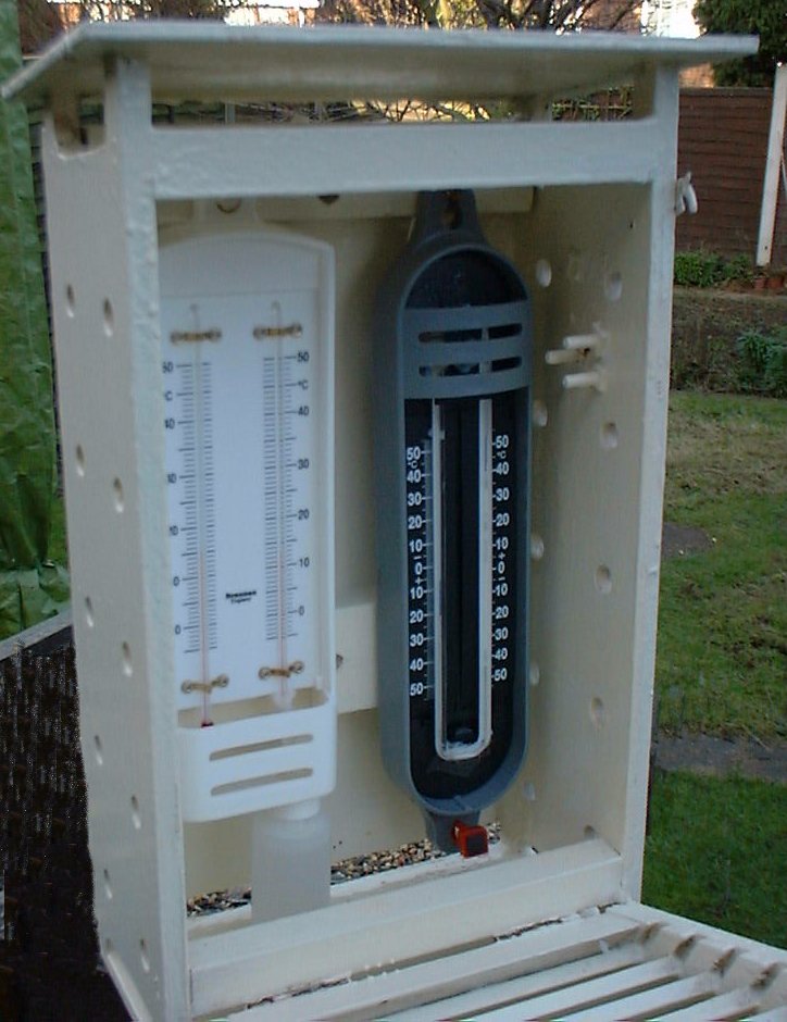
The screen is located 1.2 – 2.0 meters above the ground. The screen keeps direct sunlight from falling directly on the thermometer. Direct sunlight is just one of the multitude of things that can effect and distort temperature readings.
  • The temperature of the oceans, on the other hand, are made by ships and special buoys.  These measure sea surface temperatures (SST) that, naturally, is the temperature of the water, not the temperature of the air just above the water. Water temperatures are converted to air temperatures with complex calculations.
  • For the Earthly average, the land and sea temperatures are ‘blended’ with complex computer algorithms.
  • Just in case all that seems straightforward, since 1979 a series of satellites have been launched that measure the temperature of the Earth from space.

Over the next several posts I’ll look at a number of the issues in the temperature record.

I’ll focus on what I believe is the main issue. The extraordinary claim of extraordinary accuracy.

One of the surface data sets, CruTEM4, the surface record for HadCRUT4, is based on data from 4828 weather stations world wide.  Of these, 1760 or 37% are in North America. By comparison, just 336 or 7% are in Australia. I’ll look at the distribution of weather stations and the machinations that their raw temperature data is subjected to in a separate post.

It’s interesting to note that the Australian Bureau of Meteorology (BOM) lists 20,104 past and present weather stations in Australia. Of those, 896 or 4.5% have a World Meteorological Organisation (WMO) number. Of those only 336 or 1.7% are considered by the Hadley Climate Research Unit for inclusion in CruTEM4. Makes me wonder what’s wrong with the other 98.3%. How widespread is this practice? How many weather station are there across the world that are not considered by the climate change “authorities” like The Hadley Climate Research Unit? Another topic for another post.

To focus even closer, for this post I’ll limit myself to the surface temperatures and one type of thermometer, the maximum-minimum thermometer, sometimes called Six’s thermometer. These have been used for many years but have been replaced by newer temperature loggers that record the temperature at various intervals. Automatic weather stations used by the BOM record temperature every minute.

I’ll start with the simplest case: Measuring the average temperature at one spot. If you’ve been following this, I’ll be using data from my two temperature loggers that I’ve imaginatively named Red and Green. As before, Red and Green are located on the windowsill of my office in Traralgon, Victoria, Australia.

Another simple experiment

I’ve run Red and Green for several days collecting data every 10 seconds. In the samples shown below, I’ve only included complete 24-hour days. For each day I’ve shown the actual minimum, maximum and average temperatures using all of the available data. The Average I’ve shown is the actual average, within the 0.5 º C accuracy of the temperature logger

Experiment 6 Calculating averages

I’ve then calculated the average temperature the way BOM and other meteorological organisations do: I added the minimum and maximum and divided by two. That gave me the green column ‘Calculated average’.

I then subtracted the real average from the calculated average to get the error, shown in the first red column.

The second red column is the absolute error, done simply for this example, by just making any negative differences positive.  I want to know how much the error is different from zero.

When I average the absolute errors, I get a 0.7 º C. In other words, every day I do this the calculated average temperature is about 0.7 º C different from the real average temperature for that day.

That’s bigger than the accuracy of the temperature logger. I’ve introduced a systematic error due to the way I calculated the average.

I’ve made my measurements less accurate, not more accurate, and by a fair margin.

I’ll look at this and other errors in the temperature records of organisations like The Hadley Climate Research Unit in later posts and leave you with this question:

How can the rate of global warming as shown by the temperature record be measured to an accuracy 17 time better that the accuracy of a thermometer?

To me, accepting that is more a matter of faith than science.