“Extraordinary claims require extraordinary evidence”[1]. Carl Sagan
The International Panel on Climate Change (IPCC) tells us: “It is certain that the Global Mean Surface Temperature has increased since the late 19th century.”[2]
 |
A few sentences later, we’re told by how much: “The globally averaged combined land and ocean surface temperature data as calculated by a linear trend, show a warming of 0.85 [0.65 to 1.06] º C over the period 1880-2012.” I’ll explain some of this in a minute.
This statement includes references to some fascinating footnotes that explain what “certain” means. “Virtually certain” means the authors are 99-100% certain that the statement is correct, so I suppose “certain” is even more certain, that is, more than 100% certain. Wow, that’s certainly certain.
The next footnote tells us that the numbers in the square brackets are 90% confidence limits. I remember from statistics that this translates into ‘if I sampled the rise in the worlds temperature over this 132 year period, one hundred different times, I would get a number between 0.65 and 1.06 ninety times. Of course I’d also get a number outside of this range ten times.’ I might even get 0.85 occasionally. Or not.
To me this range of uncertainty is a crucial aspect of the dogma related to climate change.
We are told to accept, without question, that it is possible to measure a change less than one degree, in the average temperature of every point on the Earth’s surface, over a period of 132 years. What n extraordinary claim!
OK, let’s start simple.
Question: How do we measure temperature? Answer: with thermometers.
Question: How accurate are they? Answer: That depends.
I’ll come back to how temperatures were measured back in 1880 in a later post, but how about now?
 |
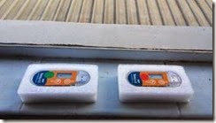
I got hold of a couple of inexpensive temperature loggers. A Chinese company, Tempsen, makes them for putting in trucks or restaurant fridges to keep a record of the temperature food’s kept at.
They claim an accuracy of 0.5 º C, not as good as the claimed accuracy of the 0.2 º C for the Hadley Research Centre data, but good enough for us.
I’ve added green and red dots so I can tell them apart. They’re actually named DB19M31238 and DB19M31236 but I call them “Red’ and ‘Green’ for short.
OK then, what can we do with them?
1. Look at how the temperature varies over a few days. Each logger can store about three days worth of data with the temperature sampled every 10 seconds. How cool is that?
2. Look at how the location of the thermometer affects the readings. We’d expect that being in shade or directly exposed to the sun would make a difference. It will be fun to see how much. Weather stations are housed in enclosures called Stevenson Screens. You can buy a nice one for $A990. I won’t be. I’ll look at the details of these later and I might have a crack at building suitable substitutes for Red and Green.
3. Look at how objects near the thermometer affects the readings. Does a thermometer surrounded by grass get the same readings as one surrounded by bitumen? Probably not. A key adjustment to ‘official’ temperature records is adjustment for the urban heat-island effect (UHI). We can use Red and Green to check this effect ourselves.
4. How much does temperature vary over distance? A key practice of the ‘official’ temperature record keepers is to ‘homogenise’ readings. (No, there’s no mixing of milk and cream involved.) If a weather station doesn’t show sufficient global warming, a simple way to fix that is to use the readings from another, hotter, station instead. https://www.facebook.com/denial101x has a video from Kevin Cowton from January 26, 2015 explaining how the temperature records for all of the weather stations in Paraguay were adjusted to match weather stations outside of Paraguay and to turn an inconvenient cooling trend into a proper warming one. I won’t be going to South America (or even South Australia) but I can explore how temperature varies over even short distances, like between my house and the Traralgon Airport.
I’m sure other experiments will occur to you and me as things progress. I’d love your suggestions.
I’ll finish this post with a bit of data collected from Red and Green just to show you what it looks like.
The day I got them, I set them running and the next morning worked out how to transfer the data from the loggers to my PC. I collected data from 3:36 PM on 17/3/2015 to 08:12 AM on 18/3/2015.
Here are the first few rows of the data:
| Colour | Device | Dataset | Colour | Device | Dataset | ||
| Red | DB19M31236 | EC12153551 | Green | DB19M31236 | EC17153551 | ||
| Points | Elapsed Time | Date/Time | Temperature(°C) | Temperature(°C) | Delta Tt | ||
| 1 | 0s | 17/03/2015 15:36:34 | 26.3 | ||||
| 2 | 10s | 17/03/2015 15:36:44 | 26.4 | ||||
| 3 | 20s | 17/03/2015 15:36:54 | 26.5 | 25.3 | 1.200 | ||
| 4 | 30s | 17/03/2015 15:37:04 | 26.6 | 25.3 | 1.300 | ||
| 5 | 40s | 17/03/2015 15:37:14 | 26.6 | 25.5 | 1.100 | ||
| 6 | 50s | 17/03/2015 15:37:24 | 26.7 | 25.5 | 1.200 | ||
| 7 | 1m | 17/03/2015 15:37:34 | 26.7 | 25.5 | 1.200 | ||
| 8 | 1m10s | 17/03/2015 15:37:44 | 26.7 | 25.5 | 1.200 | ||
| 9 | 1m20s | 17/03/2015 15:37:54 | 26.6 | 25.5 | 1.100 | ||
| 10 | 1m30s | 17/03/2015 15:38:04 | 26.6 | 25.5 | 1.100 | ||
| 11 | 1m40s | 17/03/2015 15:38:14 | 26.5 | 25.5 | 1.000 | ||
| 12 | 1m50s | 17/03/2015 15:38:24 | 26.5 | 25.5 | 1.000 | ||
| 13 | 2m | 17/03/2015 15:38:34 | 26.4 | 25.5 | 0.900 | ||
| 14 | 2m10s | 17/03/2015 15:38:44 | 26.3 | 25.4 | 0.900 | ||
| 15 | 2m20s | 17/03/2015 15:38:54 | 26.3 | 25.4 | 0.900 | ||
| 16 | 2m30s | 17/03/2015 15:39:04 | 26.2 | 25.3 | 0.900 | ||
| 17 | 2m40s | 17/03/2015 15:39:14 | 26.1 | 25.3 | 0.800 | ||
| 18 | 2m50s | 17/03/2015 15:39:24 | 26.0 | 25.2 | 0.800 | ||
| 19 | 3m | 17/03/2015 15:39:34 | 26.0 | 25.2 | 0.800 |
A couple of things to notice:
The temperature records have to be lined up. They didn’t start at exactly the same time. Green started a bit after Red. That’s easily fixed with our modern thermometers, but could be a problem with older ones that only got read twice per day.
Red and Green are identical and both have a error of 0.5 º C. The column marked Delta T is the difference between the temperature readings. Why is this so? Well, I handled them. I must have had Red in my hand for longer than I held Green and warmed it up more. It actually took about 4.5 hours for the two to read within 0.5 º C of each other and over ten hours before the reported difference was zero. When was it exactly? We don’t know because of the error inherent in the two thermometers.
To me that’s critical: All of the readings are just numbers. They are only useful measurements when the errors and uncertainty are taken into account.

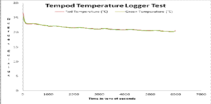
Finally, here’s a graph of the results. The numbers on the horizontal axis are just the number of each point starting at one. Points are ten seconds apart so the numbers represent tens of seconds. Minutes or hours would have been better, but this graph is just here to show what the data looks like, the trend, if you will.
If you look carefully, you can just see the difference between Red and Green at the far left, near 25 on the temperature scale.
Next time we’ll do something a bit more interesting: I’m running Red and Green for three days on the window sill of my office. We’ll look at how the temperature varies over that period and how the readings from the two loggers compare.
[2] Fifth Assessment Report, Climate Change 2013, Working Group I: The Physical Science Basis, Chapter 2, Observations: Surface and Atmosphere. Page 161. http://www.climatechange2013.org/report/full-report/ contains the full report.
No comments:
Post a Comment
Got a comment for me?