I left one of the points raised in Week 3’s dog-and-pony-show out of my last post. It’s sort of a big deal as it concerns the relationship between CO2 and temperature. That’s really the point of the whole global warming debate.
In Al Gore’s infamous Inconvenient Truth he shows the big graph of temperature above a big graph of CO2 and says that rising CO2 caused rising temperature. When the graphs are (properly) placed on top of each other, they show that usually temperature rose prior to the rise in CO2. Sort of an Inconvenient Fib.
It’s difficult to imagine how a rise in CO2 could cause a rise in temperature in the past. I‘m pretty sure Einstein proved it couldn’t. In nature, cause has to precede effect. (Not necessarily in our imaginations or “climate science” though.)
Anyway, in 2012 Shakun et al. published a paper: Global warming preceded by increasing carbon dioxide concentrations during the last deglaciation.
‘Deglaciation’ of course, is the process of a glacier melting. The normal reason for glaciers to melt is warmer temperatures. Of course, a warming atmosphere isn’t the only thing that can melt ice. A volcano, like the one under West Antarctica can do that too. Click to read about the West Antarctica volcano(s).
The last deglaciation began about 18,000 years ago, paused for a while about 13 thousand years ago continued warming rapidly until about 11,000 years ago at the start of the geological period called the Holocene. Click to see a reference for glacial timelines.
In twenty words or less, Shakun et al. claim that rising CO2 levels preceded the warming at the end of the last ice age. Even if correct, this would not ‘prove’ cause and effect. Correlation is not causation.
I read the paper during the week. Click here to download it. In brief, they used climate proxies to look at CO2 and temperature from 80 locations around the Earth. The proxies were things like ice cores, pollen trapped in sediment and various chemicals and atomic isotopes.
Figure 1 | Proxy temperature records. a, Location map. CBT, cyclization ratio of branched tetraethers; MBT, methylation index of branched tetraethers; TEX86, tetraether index of tetraethers consisting of 86 carbon atoms; Uk037, alkenone unsaturation index. b, Distribution of the records by latitude (grey histogram) and areal fraction of the planet in 5u steps (blue line). (Shakun et al., 2012)
The map shows how the proxies are distributed around the globe. The little graph on the left is interesting. It shows the number of proxies at each latitude. Half are along the equator, between 30 degrees north and 30 degrees south. There are a total of four proxies for the entire part of the globe below 50 degrees south.
The paper states that 13 proxies cover the 29% of Earth’s surface that’s land and 67 cover the 71% that’s covered by water. Even if the proxies were evenly distributed, each land proxy would cover more than 11 million square kilometres (4.4 million square miles) and each ocean proxy would cover 5.4 million square kilometres (2 million square miles). It strikes me that the proxies are a bit few and far between, but then I’m not a climate scientist.
The big deal is the next graph.
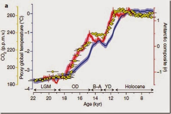
Figure 2 | CO2 concentration and temperature. a, The global proxy temperature stack (blue) as deviations from the early Holocene (11.5–6.5 kyr ago) mean, an Antarctic ice-core composite temperature record42 (red), and atmospheric CO2 concentration (refs 12, 13; yellow dots). The Holocene, Younger Dryas (YD), Bølling–Allerød (B–A), Oldest Dryas (OD) and Last Glacial Maximum (LGM) intervals are indicated. Error bars, 1s (Methods); p.p.m.v., parts per million by volume. (Shakun et al., 2012)
The red line is temperature data and the yellow dots are CO2 data from locations in Antarctica. It’s a little unclear exactly which papers and therefore which data were used, but it appears that the CO2 data comes from Monnin, E. et al. Atmospheric CO2 concentrations over the last glacial termination. Science 291, 112–114 (2001). The temperature data is reported to have come from Pedro, J. B. et al. The last deglaciation: timing the bipolar seesaw. Clim. Past Discuss.7, 397–430 (2011).
The the CO2 data (Monin et al, 2001) comes from the Concordia Dome (Dome C) while the temperature data is not actually reported in the reference given (Pedro et al., 2011) and the paper does not refer to the Concordia Dome, although it does refer to other locations in Antarctica.
The blue line is the amalgamation of the 80 proxy temperature records. Notice the horizontal scale is time with most recent time at the far right and 22,000 years ago (22 kyr) at the far left. “Now” is actually 1950 so the scale is years before 1950. I’m sure there’s a good reason for that.
Anyway, to the point:
When you look at the yellow dots and the red line, CO2 and temperature appear to go up and down more or less together. In the area between about 15 and 13 kyr, labelled ‘B-A’ on the graph, CO2 has risen quite sharply, but temperature goes down a bit and then back up a bit. So what? No clear relation of one preceding the other.
When you look at the blue line, however, between 17 and 14 kyr and again between 12 and 10 kyr, CO2 goes up and THEN temperature goes up. That’s called CO2 leading temperature or temperature lagging CO2.
This at least opens the door to the idea that rising CO2 could cause rising temperatures, but, of course, doesn’t really say anything at all about cause and effect.
Nevertheless, it caused quite a stir in 2012, particularly with media like the BBC in the UK proclaiming “CO2 'drove end to last ice age'”. (BBC, 4/4/2012)
After reading the paper and looking for the actual data, I located a couple of posts on Watts Up With That (WUWT), the most widely read blog on climate science. Click here to see WUWT
The posts examine the data from the Shakun paper and point out the following:
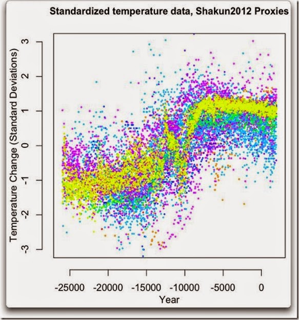
The temperature data has huge spread.
The first graph shows just the temperature data as it really is, all spread out. The Shakun paper averages the values all together that implies that the measurements are made with incredible accuracy. They’re not.
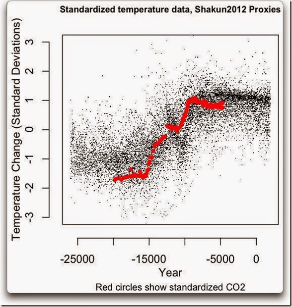
The second graph says it all:
Did CO2 rise before temperature or did temperature rise before CO2?
Answer: Who knows? You certainly can’t tell from this data. The first post can be found by clicking here.
The second post goes a step further. The author gather lots of additional CO2 data from lots of other sources, not just the single Antarctic ice core used in the Shakun paper.
Again, the CO2 data is buried in the blur of the temperature data, but look at what happens at the right hand side. Since about 8000 years ago, CO2 has been rising, but temperature has levelled off. Click here for the second post
Shakun et al. would have been well aware of that, but cut the right hand side of their graph off at about 7000 years ago.
Lesson?: Never spoil a good hypothesis by showing all of the data.


No comments:
Post a Comment
Got a comment for me?